Lovisa Aronsson
CONTENT CREATOR

Hello!
Nice to meet you! My name is Lovisa, and I’m a Stockholm-based content creator. The quick rundown – I love dogs, constantly crack bad puns and once made a silly GIF which accidentally got seen by 27 million people.
In short
PROGRAMS: Photoshop, Illustrator, InDesign, Figma, WordPress, Rule, Contentful, Flowbox, Meltwater, Brandwatch, Monday, TikTok, Instagram, Microsoft Office, Google Workspace, Microsoft Workspace
EXPERIENCE: brand development, content creation, logo design, brand guides, PDF:s, templates, linesheet, posters, social media management, feed planning, copywriting, SEO, tone of voice, newsletters, captions, product description, news articles, brand blogs, vector illustration, raster illustration, GIF:s, portraits, abstract, characters, content filming, trend watching
EXAMPLES BELOW: SoMe content creation | brand package | brand development | printed invitation | Lovisas linjer | Östgöta nation | brand blog | brand copy | newsletters
SoMe content @ Skincity
SCOPE: content planning, infographics, video editing, social media management, community building, administrative tasks, ad copy
As a Social Content Specialist my main job was to create daily posts for Instagram, Facebook and TikTok. The goal was to educate our community on the different aspects of skin care (both for skin enthusiasts as well as the absolute beginners). Our content was comprised of a combination of educational infographics, relatable entertainment as well as promotional material.
My passion project became the brand’s TikTok (@Skincity), where I had more creative freedom and mandate. I helped grow the account from less than 1k followers to over 14k in about a year. See the profile linked below.


My job included a lot of editing in Premiere Pro. This is an example of me adjusting existing Instagram content for TikTok by masking in a different background. I also added captions to different videos using AI, in order to improve our content’s accessibility.

Example of an infographic I have created for Skincity’s Instagram. I was asked to talk about ingredients suited for the winter. I researched, consulted our skin therapists, and created the structure and copy for the post, after which our designer formatted it.

During my time at Skincity I’ve filmed plenty of lifestyle material, in order for our content to look and feel more native to TikTok. Not filming in a studio means the quality is lower, which means viewers don’t recognize the profile as a brand as fast, and thus don’t scroll away immediately.
Content creation @ Sandqvist
SCOPE: brand guides, PDF:s, templates, linesheet, social media management, graphic design, newsletters
Since June of 2021 I’ve worked as a content creator for Sandqvist Bags and Items. In my work I have assisted the art director in creating different campaign material, as well as turning said material into fitting formats for social media channels, website and newsletters.
One of my latest tasks has been to create the brand package used by the wholesale team for Fall Winter 2022. This document needs to pitch the essence of Sandqvist for new, possible retailers.


Utilizing subtle graphics. The brand is very minimalistic, which can easily end up looking defaulted. Adding small graphic elements like these arrows don’t only make the information clearer, but also adds some character.

Some pages where the copy allows for more white space, I made sure to break up the monotony of the layout by going for a bold, centered quote. In this example, I used the companies mission to pack a punch.

I generally went for different titles in the header and as part of the copy. This is because one has an orientational purpose and needs to be clear (the header), whilst the copy aims to be more inspirational and draw the reader in (copy).
Brand copy @ Sandqvist
SCOPE: tone of voice, brand copy
Oftentimes the copy is written with the information in mind, rather than the customer. This means that the first draft tends to be pretty dry and contain long sentences which are hard to follow.
When I rewrite copy I aim to add a friendlier and more approachable tone of voice. I avoid info-dumping and try to give context and explanation to the topic.
The example linked below is an update I wrote on Sandqvist’s different commitments to sustainability. To the right you can see it on the print file, about to be printed on the paper carrier bags used by all stores.
Brand Development @ AskBillie
SCOPE: brand guides, PDF:s, templates, linesheet, social media management,
Our task was to build a booking platform for all things car related for Mekonomen. It needed everything. Brand, business plan, name, logo, concept, website and interface. The brand name we came up with was AskBillie.
My focus were the illustrations, logo and design.


The rounding of only three corners is meant to emulate a speechbubble. Logo reflecting the conversational aspect of the platform, unique to this brand. The icon version takes the three dots and period from the logotype to create a ”currently typing…” association.

The colour scheme consisted of one bold main colour (called Road Sign Blue, bottom right), three additional brand colours and two neutrals. On the left are the supporting secondary colours, mainly used in illustrations. This gives the brand cohesiveness whilst still being versitile.

The overall design was made to balance the friendly, sketch style illustrations with the bold, assured typography. We wanted the customer to know that we were happy to explain things, but never question that we knew what we were talking about.
Ball invitation @ Östgöta nation
SCOPE: branding, content creation, social media management, print design, illustration, coordination
I’ve worked for a student organization in Uppsala called Östgöta nation for a couple of years. Generally, this organization has an old heritage and values its roots. At the same time it is a student organization, and so, communication needs a modern twist. It’s all about balance between tradition and fun.
One of the latest ventures is a Jubilee Ball (Jubileumsbal), for which I made the formal invitaiton. The ball is held at Uppsala castle, thus the goal was to make the invitation feel luxurious. This is the motivation behind the ornamental designs in the corners, as well as the elaborate cursive title.
The invitation was requested to be gate-folded, so I disposed the information thereafter.


The organization overall uses the county emblem of Östergötland as a logo. Wanting to draw inspiration, but keep it sophisticated, I came up with the right, modified colour scheme. For the invite, I stuck with the maroon and gold.

The ornamnental designs are inspired by an edging in a 19th century building significant to the organization. Above is part of said edging, as well as some of the digital filigree designs I’ve made to pay homage to it.

The organization’s logo (which I have also designed as part of a different brief) is featured as a seal (practically ordered as a sticker) to give the recipient an exclusive feeling when opening their invitation.
Illustration @ Lovisas linjer
SCOPE: brand guides, PDF:s, templates, linesheet, social media management,
Lovisas linjer is an Instagram page serving as a creative outlet. I work both in vector and raster, and I try to explore different styles as I feel inspired.
Lately I’ve really enjoyed playing with undertones, light and bold colours. Especially working with portraits, I really enjoy watching a dull beige come alive with neon shading.
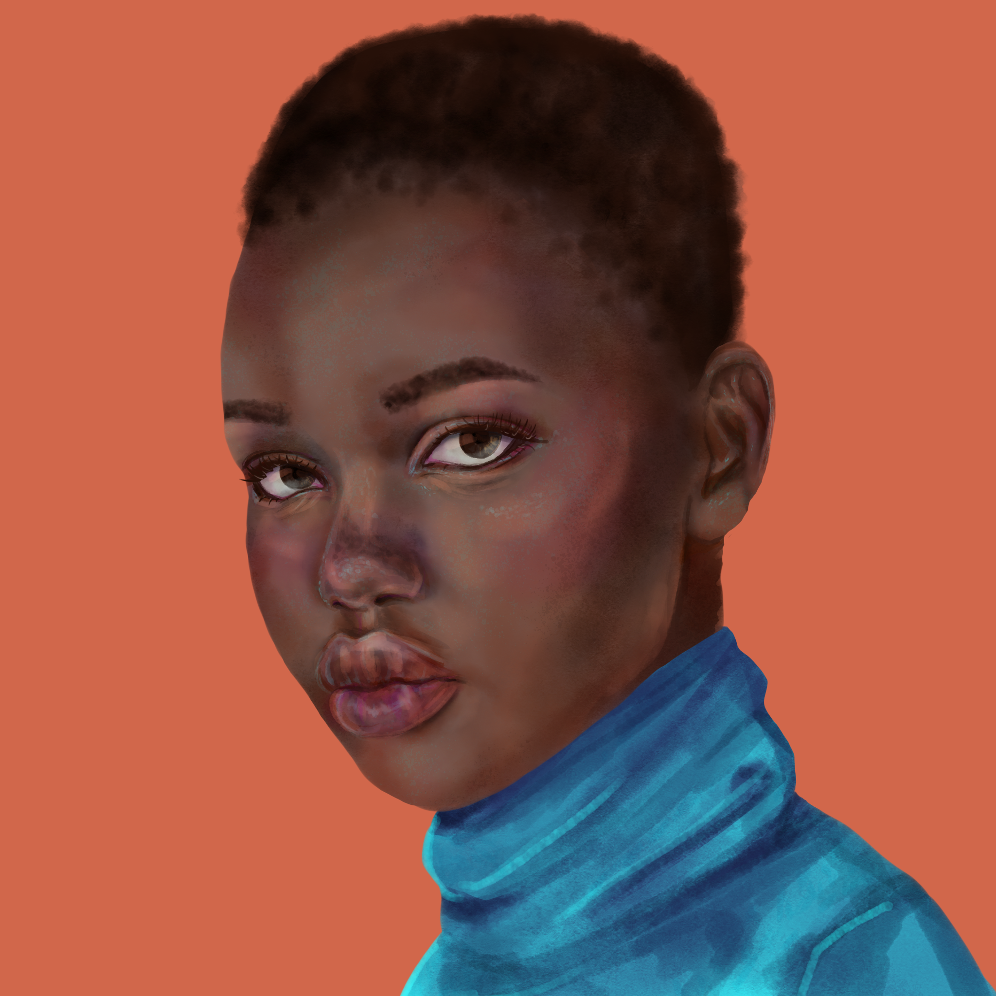


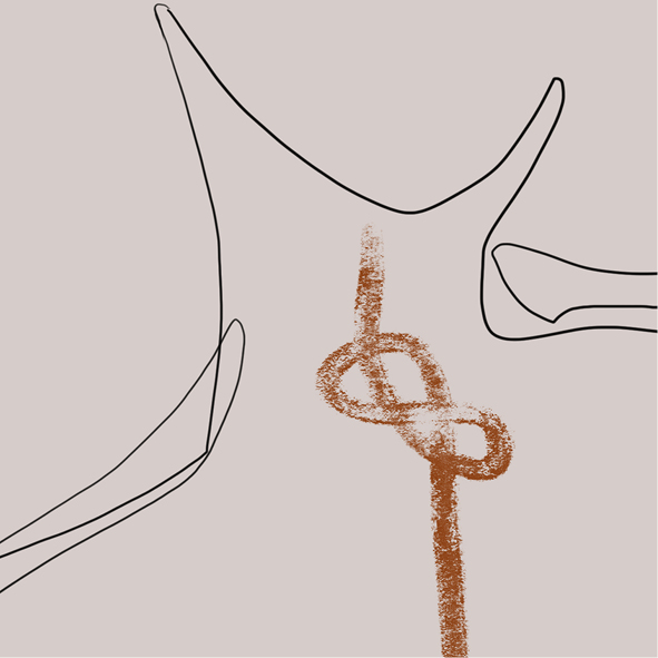
Illustration @ Östgöta nation
SCOPE: brand guides, PDF:s, templates, linesheet, social media management,
Most of the branding for the jubilee at Östgöta nation is in the form of illustrations. I needed a style which was possible to recreate with a quick turnaround, and which could easily scale without losing quality in case it was needed for prints. This is the style I came up with – simple shading, strict colour palette and playful.
The griffin character is replicating the brand’s century old logo. I made it friendlier and came up with an emotional chart for it. That way we could have branded GIF:s and emoticons. This same idea goes for the hand (talon) gestures.
Current best perfoming GIF is the ÖG-balloons, which has just under 1 million views as of March 2022.


Brand blog @ Mynt
SCOPE: brand guides, PDF:s, templates, linesheet, social media management,
For about 6 months I worked part time at Mynt. My goal was improving their Google ranking, both by onsite SEO-work and by runnning their blog.
I planned, researched, wrote and scheduled their blog entries during this time. My goal was to keep the content relevant to their clients, and not only fill their website with text. They technically targeted all businesses, but I focused the blog on small businesses. I reasoned that they are more likely to stumble upon us on Google, as they most likely did their own research rather than hiring an accountant when running into questions.
I ran the blog from July 9th up until January 29th 2021, posting an article about once a week.
Articles were published through the CMS Contentful.

Newsletters @ Sandqvist
SCOPE: brand guides, PDF:s, templates, linesheet, social media management,
Since September of 2021 I have planned, written and designed newsletters for Sandqvist. Currently we send two a week based on our GTM plan, as well as any additional campaigns, discounts or information from other departments.
Newsletters are handled through Rule. I’m currently working on improving my assessment; doing A/B-tests of headlines, local languages and persona specific campaigns.
